I decided to redesign SEPTA's subway because it is a terrible service that continues to be terrible. However, my redesign make it so the service is a lot better.


 First off, Kanye West isn't as big of a jackass as I thought we has because this little gem came from his blog. This vehicle called the "Simple concept" a misleading name if I ever read one. Its a three wheeled vehicle, a trike if you will, that leans as it moves, like a motorcycle. It has decent an electric motor and boasts a 120 mph top speed, and since its a BMW I think that speed is actually attainable. The shock factor: it can make 60 miles on a half a gallon of gas. Half a gallon, that not even close to being a guzzler. I see this vehicle being practical for people who need a way to get around and doesn't mind riding in something resembling a jet cockpit. Personally, I want one of these cars just so I can hug corners and have the car lean with me, unlike my current car. This should be a car for Philadelphia because the streets are narrow and parking sucks, unless you ride a bicycle. The car is small, nimble, and probably can be parked in spots that Mazda Miatas wish they could fit in. If these things were supercharged and boasts BMW's signature speed, I could see these little machines pulling over speeders on the highways. This is definitely a great way to cope with shrinking urban environment where cars cramp every corner of the street. THe Simple concept can help alleviate that.


 Humor aside, cell phones of the current era have begun to slip into creeping featurism as noted by Donald Norman as "the tendency to add to the number of features that a device can do, often extending the number beyond all reason" (173). Over the years, cell phones have evolved from devices strictly for telecommunication purposes to multiple tasked devices that can make voice and data calls, take photographs, play video games, and directing us in the car as we drive. However, cell phone design has been interesting to say the least.


A Swedish Radio Car Phone
This particular interface for mobile communication required a separate operator for use. The operator had to monitor the signals on the dials as well as the switches to control the phone as there was no single channel for two way calling, the caller had to push to talk, like a two way radio. This unit was bulky and was only as mobile as the car it was in. It did help in terms of mobile communication as this was an invaluable tool for communication in the armed force, primarily on vehicles in combat. Based on it’s appearance, it would appear to require a thorough reading of the manual because the design itself doesn’t tell you what to do. In line with what Norman has said about aesthetic and how designers can go astray, the mapping of the phone is good because all the controls are well placed and visible. However, operating them was a mystery if you had not been trained or had the manual on hand, as there are no visual cues like text or symbols to help guide the user. Most models weighed several kilograms, and based on their weight, were only practical for in vehicle usage. These car phones would be the starting point for mobile communications. The later phones would be designed so there would not be a separate operator, and the phone would be easier to use based on its appearance as well as much more mobile.

Motorola DynaTec 8000x
1983- The DynaTac was released for to the commercial market after being approved by the FCC. The phone sold for $3,995, a very high price however it was new technology that allowed you to call without having to be attached to a wire.
The DynaTac’s design is better than the previous car phones as it had a similar appearance to a standard landline phone. It weighed 28 ounces and 10 inches tall. This phone is a major improvement over the older and bulkier car phones of the past. Its mapping resembled that of a home phone and operating it's primary features didn't not require a separate operator. The red LED screen displayed the numbers that were dialed. Also, the additional buttons underneath the numbers were easy to understand but without the screen functioning in coordination with the additional buttons, it was hard to figure out if your input had gone in correctly. There was feedback generated by the phone but without the screen, you were never sure of what you did. While it was much more portable than the previous radio car phones, it was still very bulky and slightly difficult to use based on the weight. The volume control was on the front face of the phone, and there was only one button to adjust it. Its large size made it impractical to use unless you needed to be in constant contact with someone. Later cellular phones of this era would begin to shrink in size, and their ease of use would grow substantially.
1989- The Motorola MicroTAC (Total Area Coverage)


(Pictured are the Motorola MicroTac 8900 (Top) and the MicroTac Elite (Middle), an advanced variant
and a comparison of the two (Bottom)
The MicroTAC was a major improvement in terms on interfacing with ease. The phone is much smaller than its predecessor, the DynaTac. Also, the phone featured a better LED screen, and later versions featured LCDs that allowed the user to see and know what they were doing on the phone. The button mapping remains the same from the DynaTac. The buttons for volume adjustment were placed on the side of the phone, which allowed the user to change the sound output mid call with one hand as compared to the DynaTac, which only had one volume button, on the front of the phone which would not allow for that affordance. Also, the number pad featured a green “Send Button” and red “End” button, helped the user identify what function to use a lot quicker and easier. It played on the “green is to go as red is to stop” analogy that we learn from seeing traffic lights. The MicroTac’s affordances were numberable as it had a numeric memory set up. A number would correspond to a menu option, which could be confusing if the user doesn’t have the list of corresponding number/menu options in front of them. This an early example of creeping featurism, as the phone had an organizer, memo, and calculator functions. Also, the other function buttons on the phone are set up beneath the number buttons and are smaller than the number buttons as well. It alludes to the importance of the numerical buttons but organizes them so that the user knows where the button is based on size and location. It weighed about 12 ounces and when opened was about 9 inches long. However its fragile design and power workmanship made this phone hard to use without damage. Its flip portion was easily broken due to its construction, and also users had difficulty with the battery. Phones created after the MicroTac would employer better workmanship, better parts for sound signal, and different designs and styles.
1996 Motorola StarTAC

Motorola StarTAC 3000
The successor to the MicroTac, the StarTac was major improvement as it supported multiple networks. both digital and analog, and was more sleek and lightweight. The phone was the first clamshell phone, that folded up into half of its full size. The StarTac weighed only about 3 ounces. The phones layout was much different than its predecessor. The screen and the number pad occupy the same part of the phone, whereas there was a separation on the DynaTac and MicroTac. The color coded buttons return as well as the differentiation of button size, further organizing the phone. Other new additions include a menu button and two additional buttons MR and M+, which can be assumed to coordinate with the menu button. Also, the screen is larger and is an LCD screen. Earlier models still relied on LEDs but those were much more advanced than the MicroTac, utilizing longer lines of LEDs, and having two rows instead of one. It is considered one of top devices of the last fifty years because the phone had such advanced features. Later models had a push to talk service feature that allowed you to communicate without having to dial a number. Also, it utilized Silent Message Service, also known as SMS or text messaging, one of the most used features used on phones currently. The StarTac shaped the cellular phone world as to its user friendliness, portability, and its usefulness. The only known problem with this particular phone is the sounds quality of the earpiece. Its concave design is more conducive to sound but not to one’s ear as the horizontal orientation of the earpiece does not keep out ambient nose. Phone companies like LG, Sony, Ericsson, and Motorola would start more features to their phones like cameras, and mobile internet. The StarTac set the pace for the cell phone market as prices dropped and mobile phone service became more readily available.
2004 Motorola RAZR

Motorola RAZR V3
The Motorola RAZR was a pioneering phone of design and ease of use. It adopts the clamshell model of StarTac, but places the screen on the upper part of the clamshell. Two of the most important features are the external LCD screen and the slimline design. The LCD screen essentially allows the user to view what is on the phone without opening it. The small LCD was used for caller ID, which allowed the user to see who was calling without opening the phone, allowing for call screening to be almost effortless. The slim design of the phone was one of its major selling points. The name RAZR came from its slim design, one that was only seen on prototypes of cell phones. The radical design of the phone could qualify as a designer straying from usability however the phone maintains the same layout of a standard flip phone, which was years past the StarTac. The phone capitalizes on sleek as all the buttons on the phone do not stand out much from the phone. The interior buttons hardly qualify as buttons because they are all on the same piece of metal, divided by curved lines of plastic that are illuminated for use at night. The design was popular with users and was more practical that the previous phones use of plastic buttons and rubber buttons. In comparison with the StarTac, MicroTac, and DynaTac, the RAZR is superior to all in portability, power, signal strength, ease of use, and style. There were problems with this phone that did not affect other previous phones. Primarily, its slimline design did not allow for physical error. A fall over 3 feet would result in a high percentage of phone errors and physical damage. Also, its small size caused problems for those with larger hands, as the dial pad was trickier to use. The RAZR would continue to into many iterations with the same style keypad and slimline design but incorporating a larger screen, different configurations including a sliding variation which incorporated into my phone redesign, and transmitting strengths.
2007 Apple iPhone

Apple iPhone 1st Generation
The iPhone, created by Apple, is one of the most popular cellular “smart” phones on the market right now. Its high points are the software interface, the physical design, and usability of the phone in the real world. The phone’s interface relies on icons with captions as well as a touch sensitive vibrating screen. The screen also allows for multiple fingers to touch the screen in certain motions to correspond to an action on the phone. The amount of functions that this phone can do comes close to creeping featurism. Norman writes that “Creeping featurism is the tendency to add the number of features that a device can do, often extending the number beyond all reason”. There are several applications that can be downloaded in addition to the email, iPod music player, and You-Tube viewer that come with the phone. Several of these applications are frivolous and are subject oriented. This phone has a thousand uses however its design does have flaws. The touch screen is made of glass and if dropped on its face becomes totally useless. There are screens to prevent scratching but a fall from five feet could easily shatter the glass. Also, there is a lack of buttons or toggles on the outside of the phone. The top power button and the menu button at the bottom of the phone are only two analog controls on the phone. The entire phone is dependent on the screen and there are no other affordances on the phone to use in case it is damaged. The large screen and shape of the iPhone are the two elements that I used in my phone redesign.
2007 Verizon LG Voyager

LG VX10000
The LG VX10000 aka known as the Voyager, released the same year as the iPhone and was coined by many critics within the cellular phone industry as an “iPhone killer”. Its similar design, and features deemed it competition from Verizon to combat the rising sales of the iPhone. The primary difference between the iPhone and the Voyager is that the Voyager is candybar clamshell phone. Creeping featurism is not as rampant on this phone because Verizon's phone operations limited what you can do as to features. It has the size of the iPhone but it much thicker. The phone opens up and reveals a second screen with a full QWERTY keyboard. This design addition automatically made the Voyager superior in terms of interfacing because it copied the interface of a computer keyboard and replicated it to the Voyager with the function buttons to the side of the keyboard. Alsom,The touch screen vibrates in response to touch similar to the iPhone but this touch screen is plastic coated so it won't crack if it falls unlike the iPhone. The Menu layout is very self explanatory as an icon denotes what menu it goes to. The iPhone does this as but the icons on the screen lead directly to applications, whereas the Voyager organizes applications, music, and videos into their own menus. There are more problems with this phone than the iPhone primarily because of design flaws. The wiring for the touch screen is routed through the hinges that allow you to open the phone. Frequent opening and closing of the phone can lead to an unintentional wear and tear of the wiring of the touch screen, causing a delay in reaction time for the phone and damage to the touch sensitivity. Also, one particular problem with the phone is the screen lock that activates while its is in the user's pocket. The Voyager is my current phone and I think it suffers from unfulfilled potential. The basis of my redesign uses many of the Voyager's features as well
The Redesign
Taking all the previous phones into consideration, the phone I chose to redesign was the Verizon Voyager because it doesn't suffer from the creeping featurism of the iPhone as well as having very advanced technology. The flaws it does suffer from can be alleviated from the design of the iPhone based on screen size and its intuitive touch screen. The slimline design of the RAZR will make it smaller and less obtrusive.
First,I sketched out what I wanted to do.

Main Body of the Phone
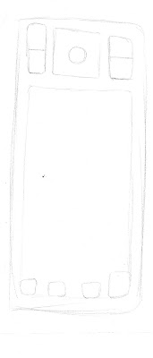
Keyboard portion
I called it the Vizier because the title of Vizier was held in high esteem as an an advisor to the king or sultan in Egypt and the Muslim World. That appeals to the user giving them a sort of esteem boost because you have an electronic advisor that will dictate your life to you (Sort of a tangent but that is what usually happens with people and smart phones). The primary differences between my remake and the iPhone and Voyager are that Vizier is the body of the iPhone, with its self contained shape, and the Voyager's interface as well as a few design cues like the manual buttons on the face of the phone.

iPhone and Voyager Menus Side by Side
Verizon Wireless Vizier

Vizier Portrait Mode (Touch Screen Active)
The Portrait Mode is the mode where the phone is held in a longitudinal orientation. This is primary orientation where the touch screen is active. The screen had been changed based on the iPhone drag and drop lock system. The Voyager's unlock feature is just touch part of the screen, which lead to accidental unlocking and dialing. At one point, the Voyager, while in my pocket changed it's settings so it automatically opens and reads my text messages. With the lock changed, that won't happen anymore. The primary screen has all the usual indicators on it. Signal strength, time and date, battery life, and service provider (In this case, Verizon Wireless). The primary screen has six widgets, each with an identifying icon. Each widget leads to a sub menu where you can access the application and its subordinating services. Also, the submenus are linked together so if you need to change camera setting and you are in the Internet submenu, you can touch the icon and it will go to that menu. This was a feature on the Voyager that I particularly liked. One key feature on this phone that the Voyager doesn't have is a calibrating sensor for finger size. Earlier, I mentioned the Razr buttons being too small for large hands. Similarly, the iPhone and Voyager had the same problem. So the Vizier would have a sensor that could judge the size of a finger and set the screen to adjust icon sizes automatically. That was one of the constraints that I couldn't appreciate, especially when the icons are so small. Also, I placed three manual buttons on the bottom part of the phone's face. The Send and End keys would be used to handle calls, and the CLR button would function as a back button for navigating menus as well as a manual backspace key for text. Those are taken from the Voyager and come in handy if you have want to call someone without pressing several buttons. Also, volume control buttons and a manual phone lock buttons are on the left side of the phone but aren't seen because they would be completely flushed with the phone's exterior to maintain a sleek look.
 Vizier Landscape Mode (Touch Screen Dormant)
Landscape Mode is the lateral orientation of the phone and is activated when the keyboard is slid down from the inside of the phone. The touch screen would still function without the touch sensors active to preserve battery life. The keys has a qwerty keyboard layout with the option buttons, a directional pad, and primary controls on the sides. One feature that I carried over from the Voyager was the symbol key. It helps when you want to use punctuation because the shift key does capital letters but the layout of a computer keyboard and cell phone keypad are much different because of space issues. The symbol key (SYM) allows the designer to consolidate the punctuation keys and the alphanumeric keys together. A feature that I wouldn't be too keen on using but would be useful is an active touch screen while in landscape mode. It would be an option to active in the settings menu, for those who want to watch videos in widescreen format on their phone (For what reason, I really can't figure out), reading and typing with wider screen, or a way to view large picture on the phone. The iPhone boasts a motion sensor that will adjust to whatever orientation the phone is set to but the Vizier doesn't have that feature in order to sustain battery life. The two buttons above the keyboard are selection buttons for the bottom menu. The left key corresponds to the left side and the right key corresponds to the right key.

Side Profile

Bottom of the Phone
Menu Layouts
The menus I created for the phone all in portrait mode but the landscape variant would just have a highlight around selectable objects controlled by the directional pad. They are also very minimal and don't have a lot of things on them.

The contact menu is fairly simple. An icon denoting what the particular text is appears on the left next to the text. Also, a photo, if available can be placed there, for a photo ID that would appear when the person calls.

The primary submenus are laid in list format. The landscape variant of the submenus would have a highlight over the selected option and numeric hot keys, for faster progression. Also, the icons on the top header also allow the user to move between menus with ease.

The Media player layout is fairly simple. The play/pause, stop, and skip/search buttons are along of the bottom of the screen. The musical note button leads back to the music menu, which is the same layout as the regular submenus. The image of what is playing along with the music information is posted in the middle of the screen.

The text entry screen is one of the most important parts of the phone because that layout is usually consistent throughout the phone. Here, it is as simple as it can get. The Voyager's text entry on the touch screen used the 12 button alphanumeric phone set up but I felt it was really pointless and redundant to still have to tap buttons rapid fire 2 or 3 times fast get text in. I took a design cue from the iPhone since I made a bigger screen and place a QWERTY keyboard in place of the 12 button set up. It is almost identical in comparison to the actual keyboard on the phone, so it provides familiarity with key mapping.
Conclusion
The world of cellular technology has yet to begin to innovate the way we live and intrigue us. Hopefully, designer will take their cue from Donald Norman so we can actually use and enjoy those interfaces instead of being eternally frustrated with them.